IML L3.2 ROC curve
ROC curve
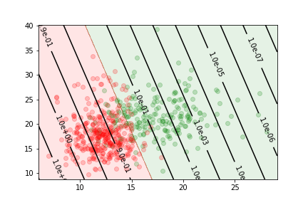
Let us consider the cancer data sample again
Quality metrics
- the performance of a binary classifier can be described by the confusion matrix
| true value is positive | true value is negative | |
|---|---|---|
| predicted positive | true positive TP | false positive FP |
| predicted negative | false negative FN | True negative TN |
- From this matrix we can define several metrics to quantify the quality of the classification.
true positive $rate=\frac{TP}{TP+FN}$
and
false positive $rate=\frac{FP}{FP+TN}$
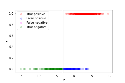
we can see how well the prediction works by plotting the true value as a function of $z$ for each data point in the training sample:
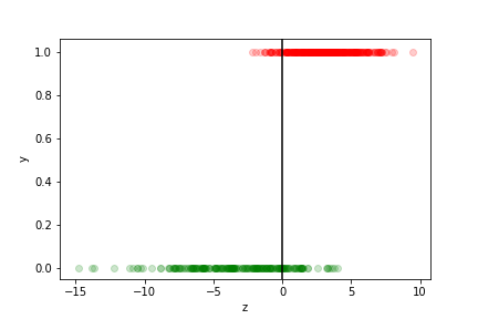
- The points with$z>0$ are assigned to the$y=1$ class
- they correspond to $p> \frac{1}{2} $
- those with $z<0$ to the $y=0$ class
- they correspond to $p< \frac{1}{2} $
The different categories (TP, FP, TN, FN) can be visualised on this plot:
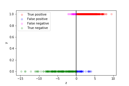
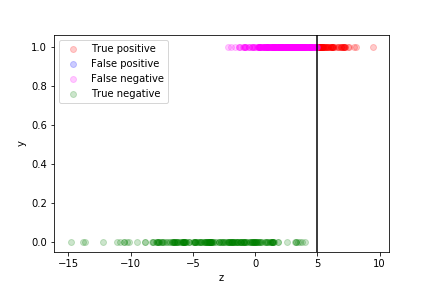
If we are more worried about false negative than about false positive, we can move the decision boundary to the left:
Of course if means more false positives…
If we are more worried about false positive than about false negative, we can move the decision boundary to the right:
Of course if means more false negatives…
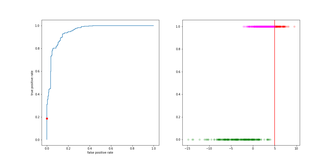
The curve describing this trade-off is the ROC curve (Receiver Operating Characteristic). It is the collection of (FP rate, TP rate) values for all values of the decision boundary.
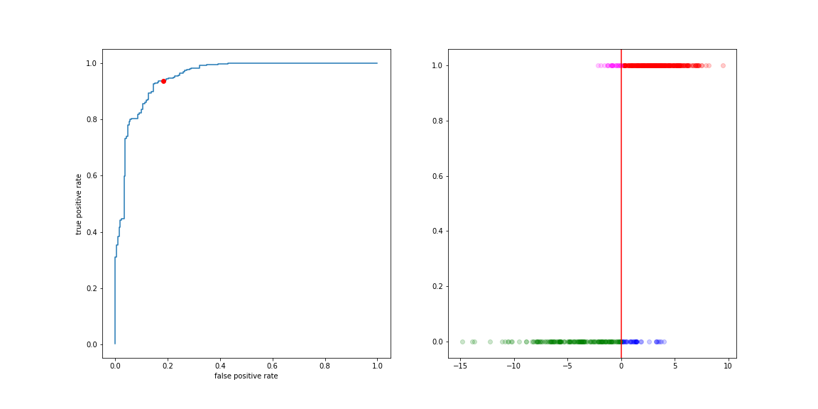
Move the threshold to the left:
- more true positives
- more false positive
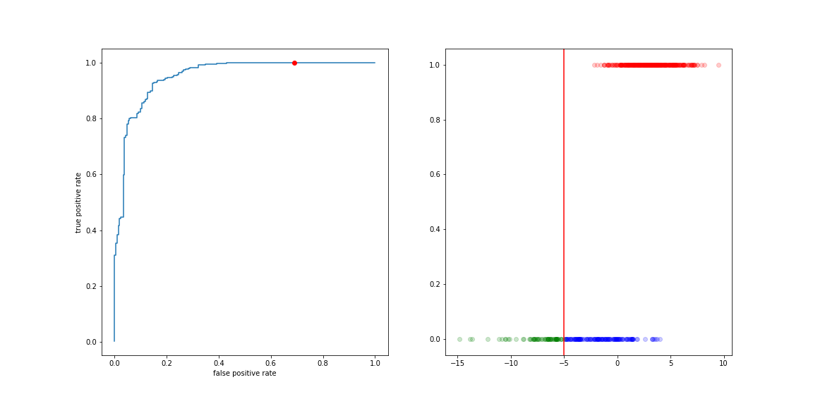
Move the threshold to the right:
- less true positives
- less false positive